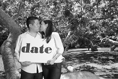
For our Save the Dates (STDs) I wanted something simple that utilized our engagement pictures (we didn’t take those suckers for nothin’!) I decided to go with the cute idea of holding up three signs stating “save”, “the”, “date”. Our photographer, Toby, was a good sport during our engagement shoot and allowed us to take way too many ridiculous pictures holding those signs. The holding signs concept is somewhat overdone- however, I found an online program that would display it in an original way.
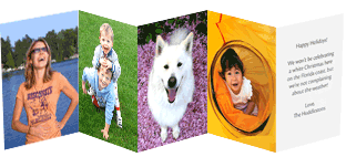
Here are the photos we chose: One color photo and four in black and white
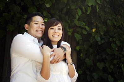
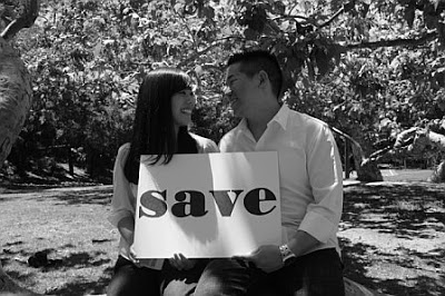
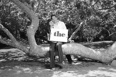
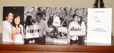
 We also incorporated a short message with the date, location and other pertinent guest information. On one of the back panels, we included our wedding website. I was happy about this because I wasn’t sure where we would include the website information. It turned out great! Here are some pictures I took of the finished product:
Here’s the frontside of the card.
Here’s the backside of the card.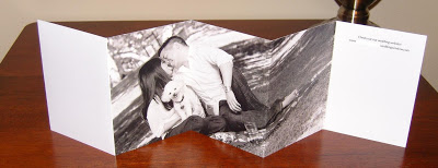 All in all, they turned out mostly how I had envisioned them. Only two minor complaints: (1) the envelopes were lacking in quality (i.e. cheap) (2) the options for formatting the text of our card were limited. I was only half-satisfied with the text because it looked a bit unfinished. So there you have it!! Save the Date cards – CHECK! (All professional images courtesy of Toby Morris Photography)

heather
oooohhhh those are super cute! i see what you mean about the text, but no one will pay attention to that for too long anyways. The pictures make it, and they are awesome!
Krista
That’s cute!